Go Home

Tapster App

Relaunching an alcohol delivery experience with a new identity.

Two phones display a product listing page on the left and a sorting overlay on the right.
1 / 6
Three phones show a logo splash screen on the left, a favorites empty state in the center, and a list populated with favorites on the right.
2 / 6
Menu containing basic functions appears on the left screen and the home screen with a promotional banner and product grid is on the right.
3 / 6
Three phones show a cart empty state on the left, a cart with products from multiple sellers in the center, and an empty state of past orders on the right.
4 / 6
Left screen displays a product description page with sizes available for purchase and the right screen scrolls down to reveal stores and product details.
5 / 6
Welcome screen offers next steps to new users, flanked by order summary screens to the left and right.
6 / 6

Tapster approached INPHANTRY with a service boasting a keg delivery and retrieval system.

Tapster logo depicts a bespectacled bartender with a raised eyebrow.

First, we set out to distinguish this unique player in the business of alcohol delivery. Tapster's voice and image were born from competitive analysis, audience research, and rounds of creative iteration.

App screens are printed with descriptive captions on letter size sheets pinned to a large foamcore board.

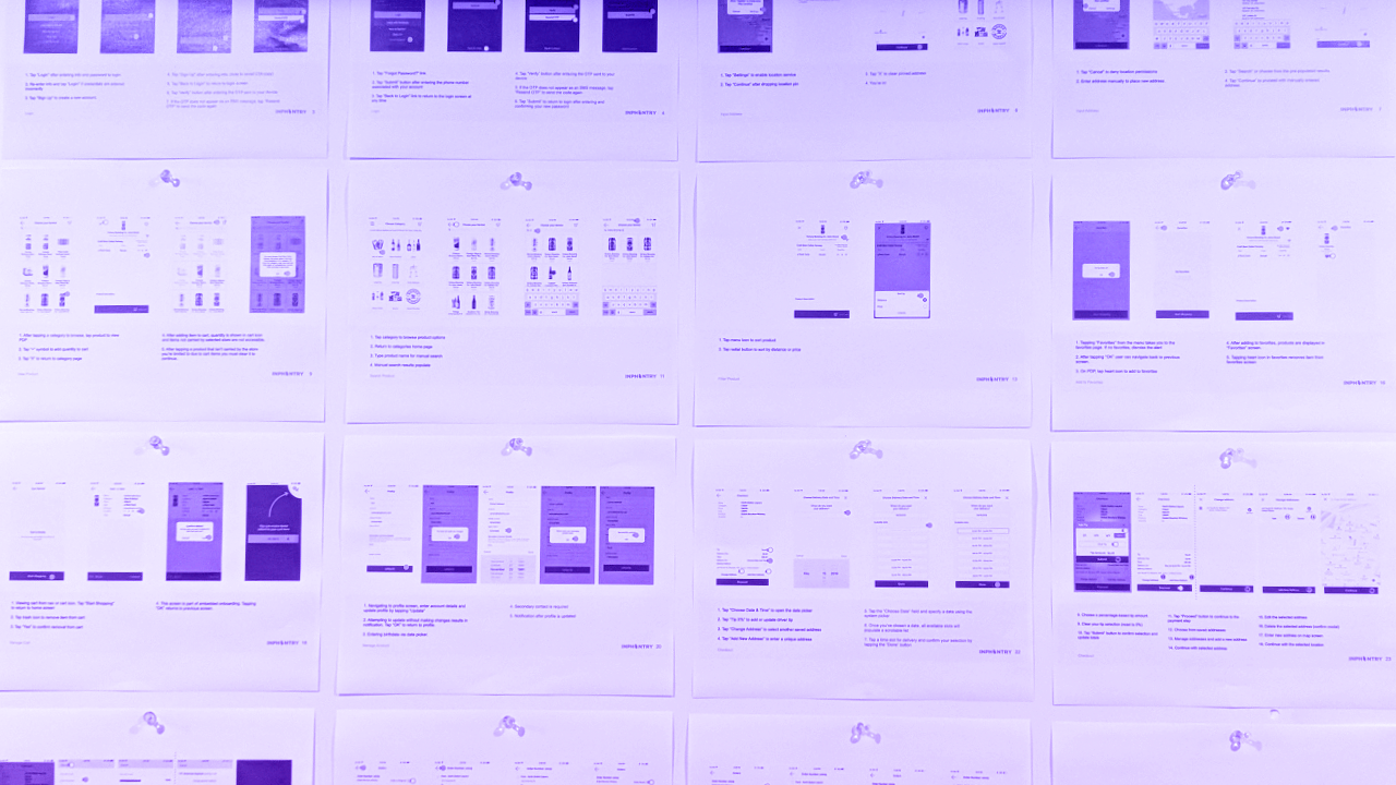
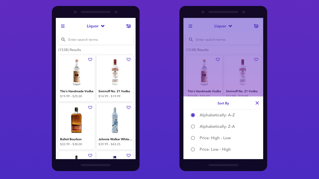
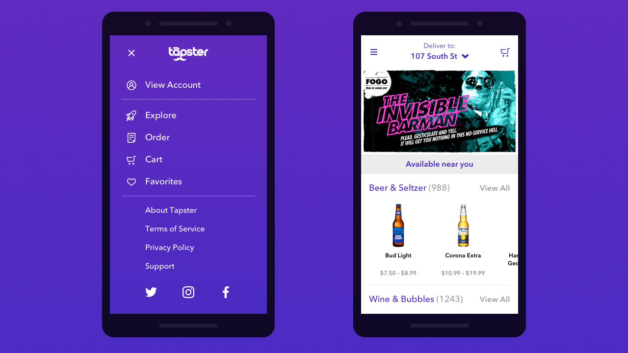
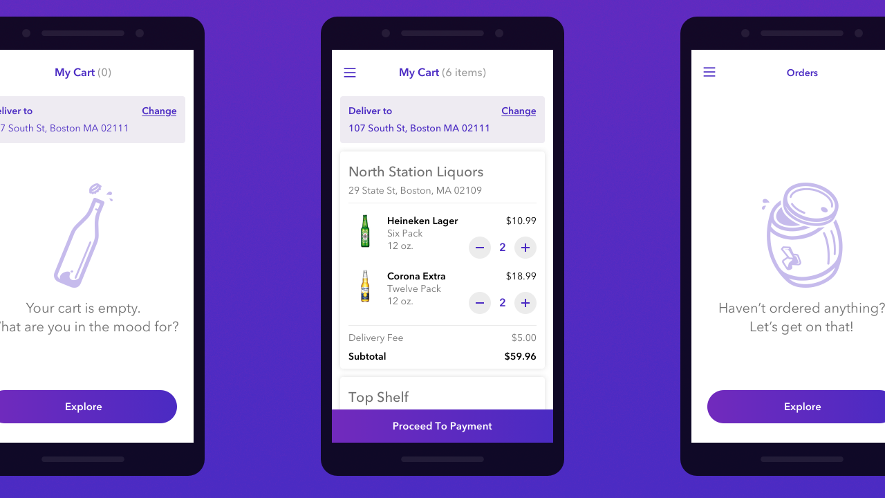
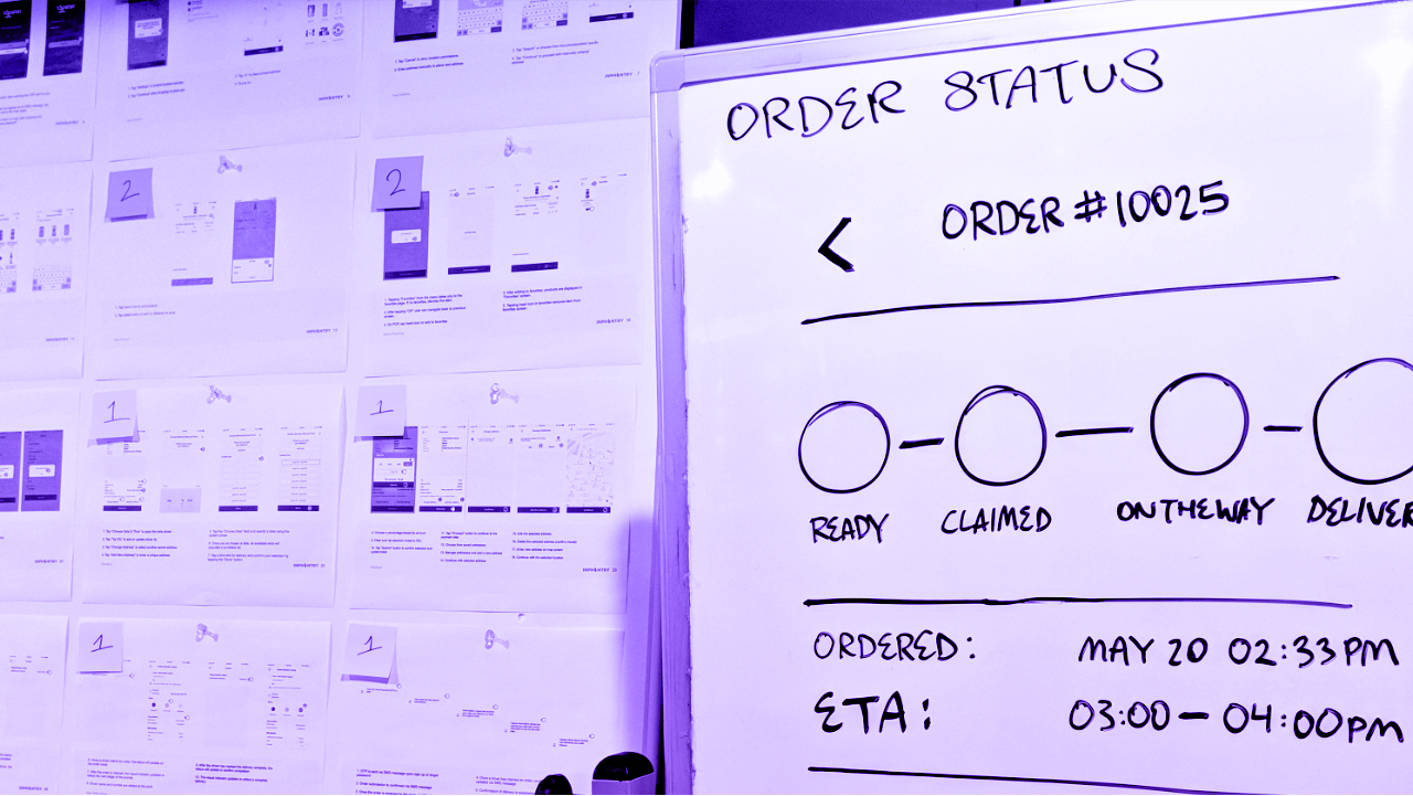
Once the looks were nailed in, the journey towards tightening the experience came into focus. We began with an audit of the inner workings of the app, analyzing every core user flow.

Variety of user stories are handwritten on index cards pinned to a large foamcore board.

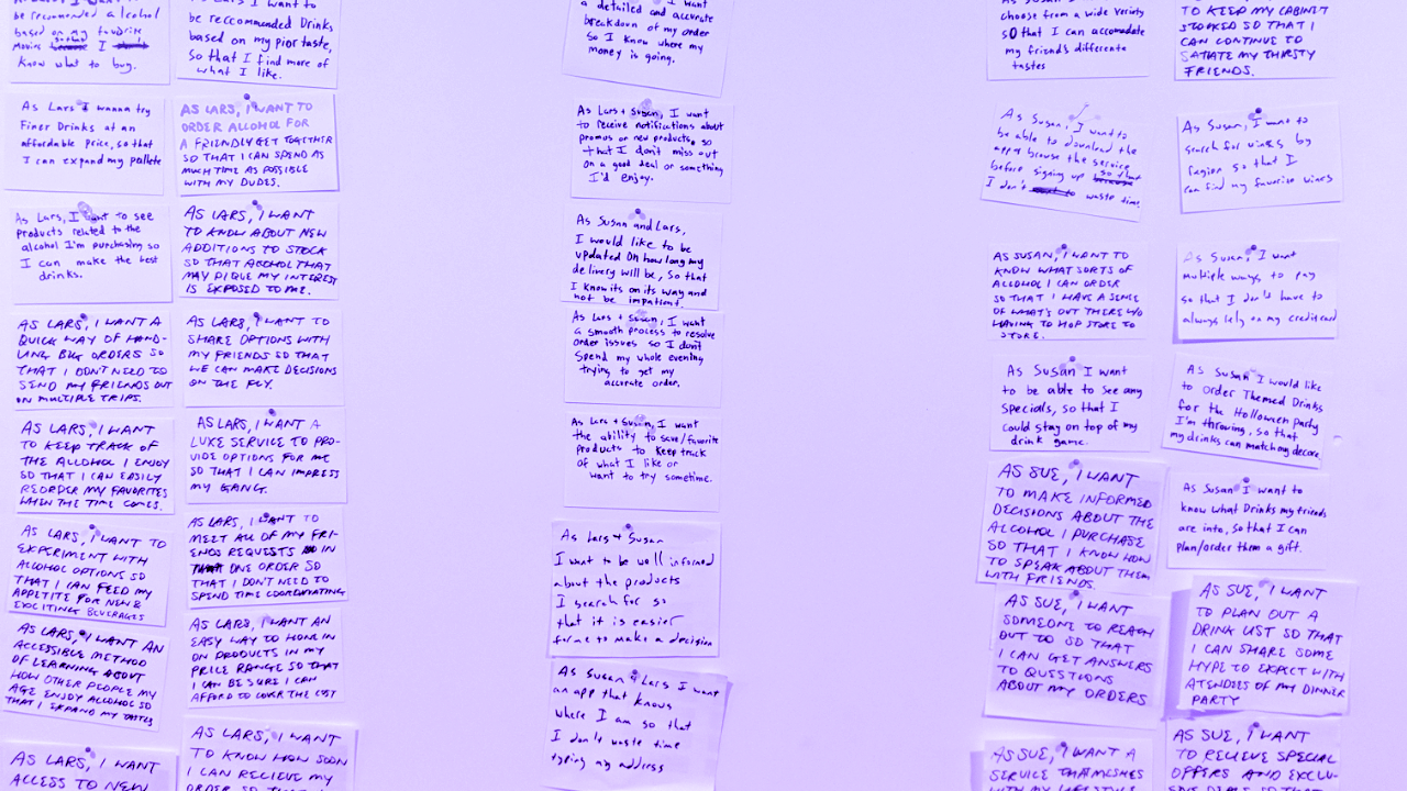
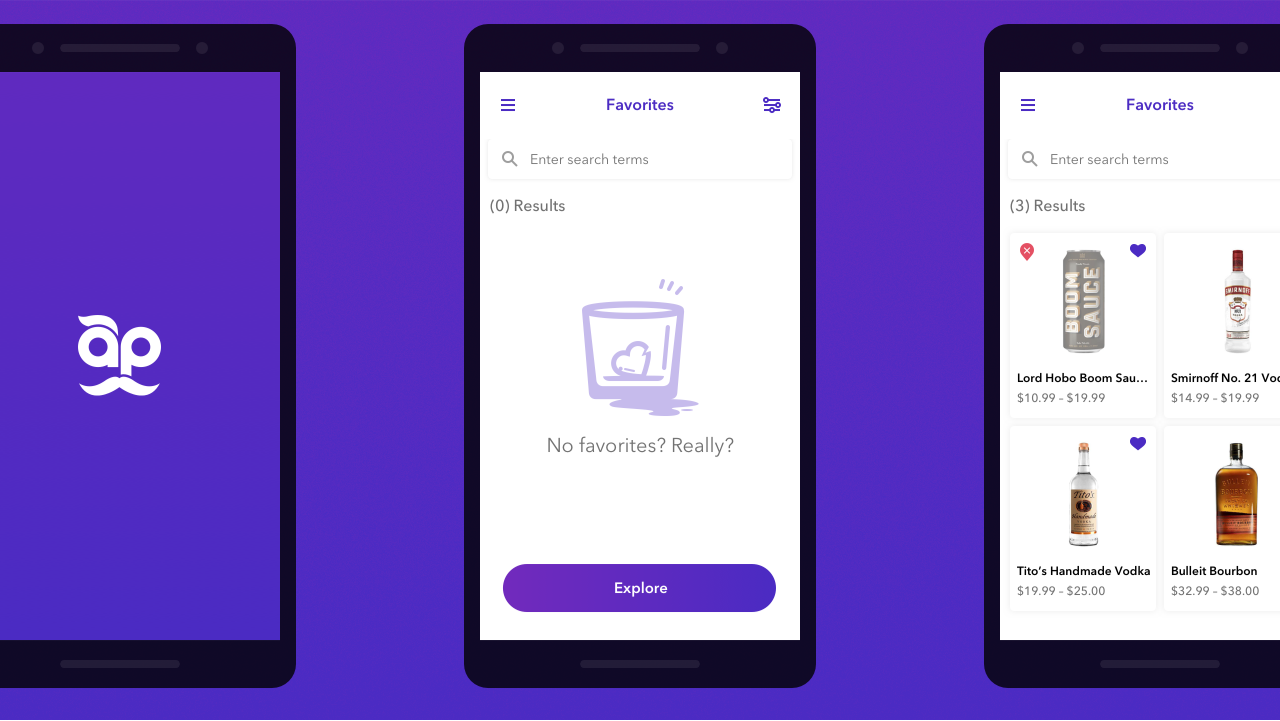
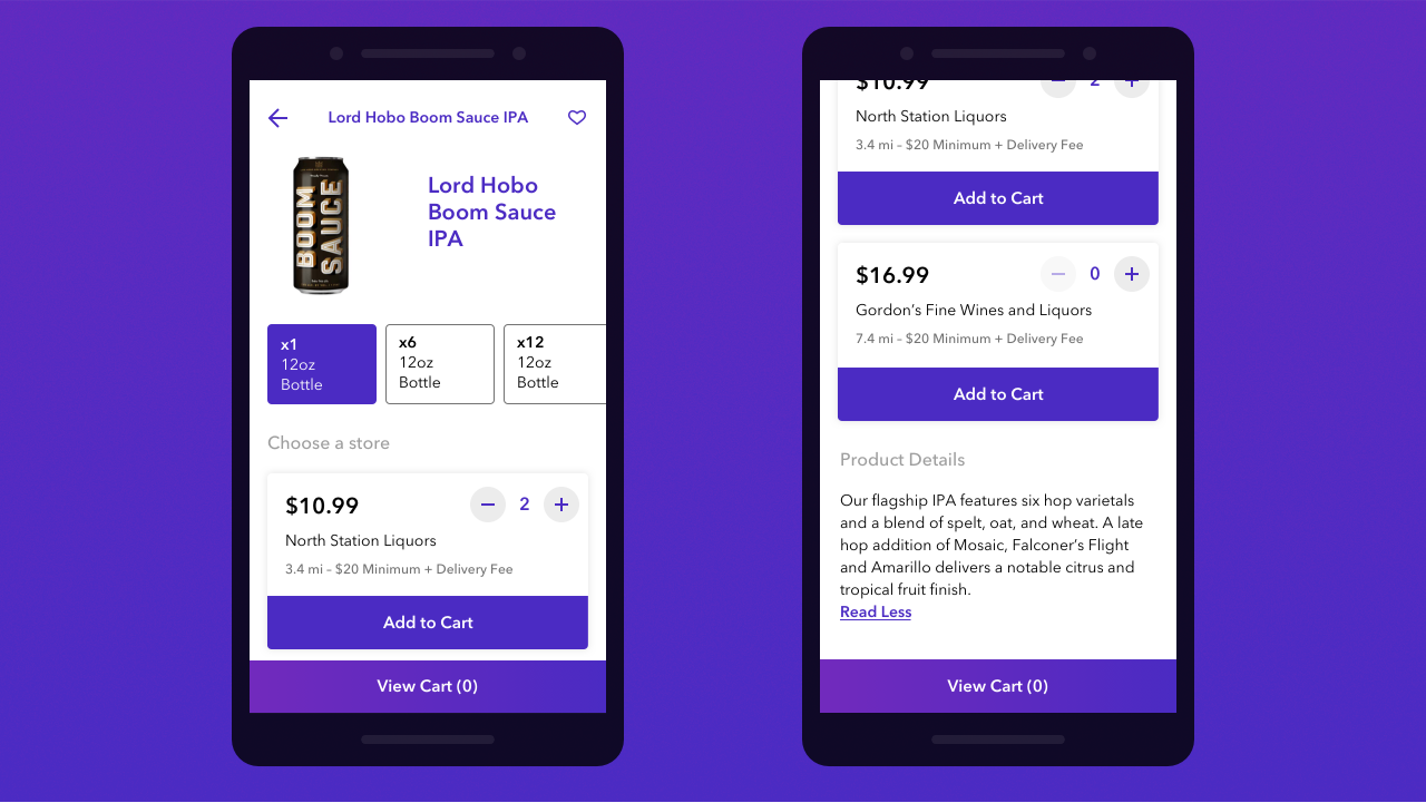
In order to push beyond the features of the first iteration, we held several user story creation sessions to imagine new scenarios. I worked with the creative director to create and organize user stories, plan sprints, and lay out a production timeline.

Dry erase board in the foreground displays sketched interface components while pinned sheets are labeled with numbered sticky notes on foamcore in the background.

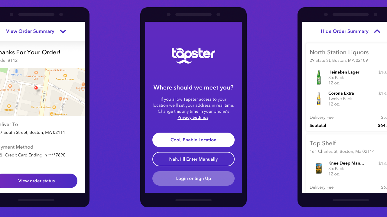
Identifying the essential components of the user journey allowed us the freedom to propose new features to augment the ordering process.

Three wireframes depict order status states during a keg delivery.
1 / 3
Wireframe triptych shows the steps to schedule a pickup of an empty keg.
2 / 3
Wireframes show a product in the cart on the left, a checkout screen in the center, and options to change or add an address on the right.
3 / 3

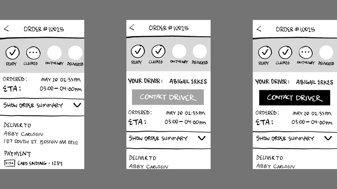
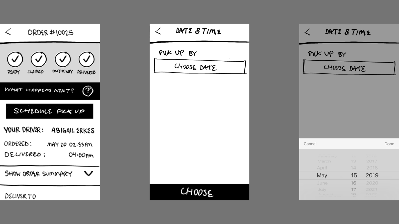
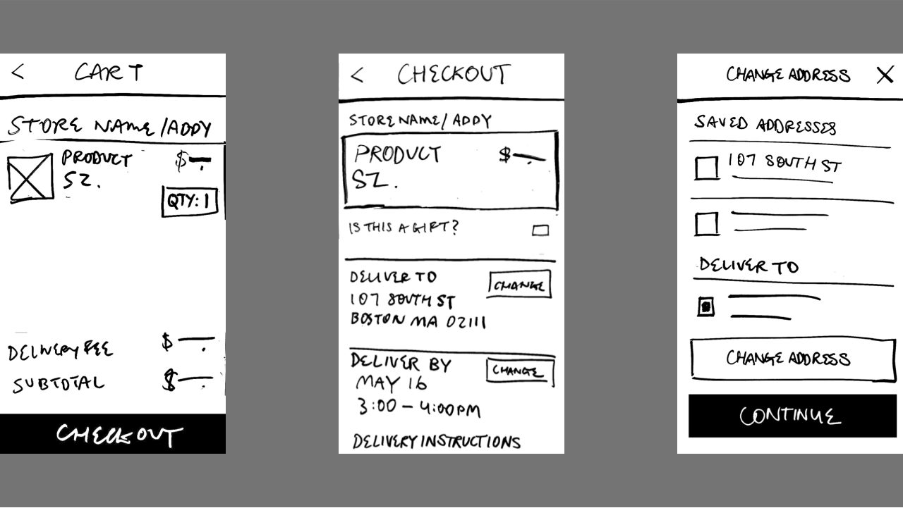
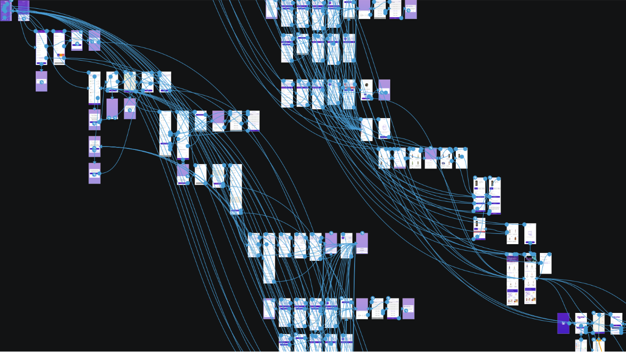
With weekly client check-ins we were constantly building new app flows. Wireframes that reached client approval made room for the next planned feature on the list. This allowed us to reveal design on a rolling basis, as well as share our plans for the next step.

Large number of artboards in sketch are organized with interconnected lines to visualize the prototype flow.

Team

  1. PM: Abby Carlson
  2. Development: Jacob Roscoe, Kevin Ngo, Derek Tran
  3. Creative Direction: Regi Jacob & Kevin Lee
  4. Visual Design: Em Montoya
  5. UX/Design: Carson Halstead

Selected Projects